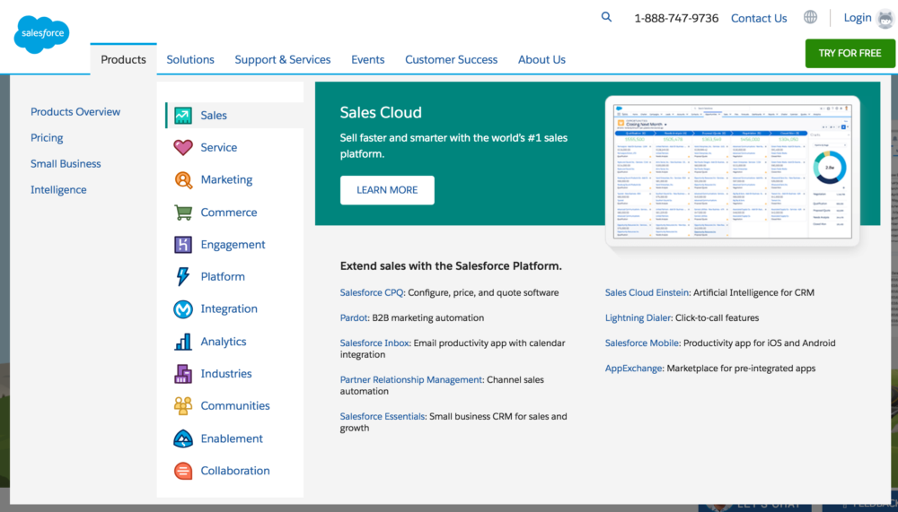
Perhaps nothing exemplifies the website browsing experience more than those ubiquitous menus at the top of every page...your portal to everything a website has to offer. As websites have become more robust and complex menus have likewise grown in size and complexity with "mega menus" including multiple columns, custom text, pictures, and even videos. Check out this sample from the Salesforce menu, which includes information multiple layers deep, custom icons, and graphics.
This approach, which has dominated website development since the early days of the internet, takes its cues from the retail experience. The company doesn't know exactly what the customer is looking for, so they need to make sure that customer has access to every possibility all the time. We even use the word "browsing" to describe the experience, as though we're enjoying a quiet Saturday afternoon at the library looking for some new story or inspiration.
And while it's true that our online travels used to be more casual, that's simply not the case any more. We don't come to a website to browse, we come to get or learn or read or do. If we arrive on a website organically, more often than not, we've arrived there from an external link on social media or another site. We don't spend time soaking in the majesty of the home page, we want to get access to the information we want right away. If a website seems too confusing, we're more likely to use a search feature than spend time navigating our own way around.
We don't come to a website to browse, we come to get or learn or read or do.
The retail metaphor is simply no longer valid, save for actual online stores or news sites. Chances are, if someone is coming to your website they've either been directed there or are coming looking for something specific. A more appropriate metaphor is a house. When you enter a room of a house, you're there for a specific purpose, and don't want the distraction of knowing what's going on in all of the other rooms all the time. Or how about an office space? Do find it easier to focus while working in an office, or in one of those big open plan environments that have become all the rage?
Great stories are not built on hundreds of distracting possibilities, they're built on big steps in a specific direction.
A big part of our pursuit of the story model is ensuring clarity. Great stories are not built on hundreds of distracting possibilities, they're built on big steps in a specific direction. They're built on carefully constructed opportunities to move forward or quit. By definition, your site's menu gives you not one choice, but a list of possibilities, each equally as meaningful as the next.
Few websites are brave enough to limit menus on inner pages to only those choices that would be meaningful to visitors on that specific page.
